
My first Double Page Spread Draft.
I had taken this picture of my model at a landscape view, intending this to be my potential picture for the double page spread, I, again decided not to capture the model in a green screen as I felt it was very important to include the naturalistic background as I maintained with the front cover. However, as I had not taken many pictures nor put as much thought towards the perfect shot, I was unfortunately stuck with a picture which would be difficult to adjust and locate at one side, as the model is prominently perched in the middle and I had planned for a very direct equal space for my textual writing and the image. The background consisted of a simple wooden bench, with some greenery perched upon a stately bricked wall. I felt this scenery would be perfect for my magazine as it had perfectly consisted with the 'elegant' image. In order to fit the picture in the order of my initial planning, I had to cut some of the image using the crop tool on Photoshop and I had to re size it consistently, as it had to measure with the size and space of my text located to one size. Finally I was able to achieve some balance of the image and text and wrote my content.
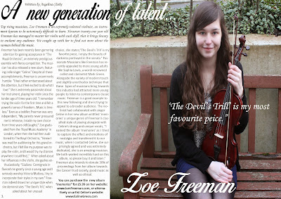
Double Page Spread Draft-Final
I had unfortunately not been able to screenshot my progress of the double page spread as I had various problems with screenshots and the risk of losing my work. I had managed to crop my picture to fit at one side of the spread, however the effect was a little poor it still looks like the image was digitally altered instead of a natural picture, so if I were to repeat this again, I would take more considerations with my shots. However the image had had not appeared too unrealistic and still balanced well with the amount of text. I had applied the font 'Birds of Paradise' for all the main headings; such as the Masthead, the Artist's name, the pull quote and the introduction whilst excluding the actual text. I had selected this font as it was primarily on my front cover and I intended to maintain this consistency. I had made the the artists name more bolder than the other features in order to outline the main source of attraction, and the application of the white colour had significantly helped this process as it stood out in the colourful background. I had applied the same to the pull quote, however I made the text much smaller. I had added these features as I wanted to apply text so it would not get in the way of the background, which was very significant to my double page spread. My Masthead which was ' A new generation of talent...' had proved to be difficult to adjust and place as it was a very lengthy title in comparison, but I needed a dramatic flair to attract the readers attention. I had decided upon placing the title primarily on the box to put text as well as slightly on the picture. I had created an almost 'mirror' effect on the title, as the Masthead had spread to the picture, I had changed the original black colour of the font to a white colour, as the original colour had failed to stand out among the greenery in the picture. The way I had sectioned the text on Photoshop was initially very difficult, however through watching videos on line, I had managed to section two text boxes as columns, to specifically allocate my text accordingly through opening my paragraph options and then clicking the 'paragraph' bar, and changing the number of the first option boxes. Despite overcoming these struggles, I still had difficulty applying text without it resulting in various double spaced text which looked very messy and I had little control when it occurred, so I had to re size the actual text box so I could prevent this issue. I had avoided using flowery fonts as I had applied with the headings, so I had applied a simple 'Arial' font for the actual content for the double page spread. I had applied the colour of the text background text as white, as I had wanted to brighten the whole spread through the contrast of the colourful background and the white section at one side. At the end of my 'interview,' I had then applied my ending text with a bold font to indicate the conclusion of the interview.


